Introduction
Challenge
One part of a Team Leader job is to fairly evaluate employees work. Based on multiple reports coming from different sources provide the most accurate feedback.
Assuring that team will meet KPIs (targets) on each work level. Provide necessary action plans based on hard data. Spot and address negative trends as soon as possible.
Business Goal
I wanted to provide a universal tool that could be implemented across all teams. Displaying aggregated data adequately to user permissions. Which is QA would be able to see only own data, TL data related to his direct reports and manager all data.
Increasing efficiency and creating accountability in reporting dashboards for Trust and Safety teams.
Genesis
The whole idea of creating that kind of dashboard started in my former workplace. I overtook a very complex project just two weeks before the quarantine.
The team had roughly 30 people directly reporting to me. Including 9 different markets, 3 completely different workflows, 3 QAs and one SME.
WFH was a very new experience for everyone and definitely, we didn’t have the proper tools to maintain teams remotely at that time. That’s why I came up with the idea of aggregating the most relevant data with the possibility of filtering by specific requirements.
I wanted to have quicker access and better overlook at the team metrics. That knowledge is crucial while planning workloads, assessing performance, and assigning resources to additional tasks.
However, after a few months, I got the opportunity to change the company and join a relatively new and huge start-up. Also in my new workplace, I noticed the lack of similar tools.
I decided to use my freshly gained UX knowledge and ideas from previous work. This time I waned to build more complex and universal platform. That is the reason this project has version numer 2.0.
Why Wilson?
I assume at the beginning of the quarantine everyone was a bit lost. Especially those starting new roles in the new workplace. We all were like Robinson Crusoe craving for someone who can help in those hard times. 🏐
Research
Competitive Benchmarking
From my observations and almost 5 years of experience working in Trust and Safety. I noticed that companies operate mainly on spreadsheets or store data in docs. Most of the dashboards, I had a chance to test, were completely not user-friendly. Designed mainly for data analysis, cluttered with details and in most of the cases useless for us data. Regular Team Lead or Manager has very basic knowledge in this area and this information might be a bit overwhelming. Also in many cases access to this information is restricted to specific people and only they could export raw data to spreadsheets.
Unfortunately, I can’t provide any specific screenshots due to data confidentiality, however, I’ll try to outline below my findings.
The main pain points:
- Divided data stored in separate files. Those kinds of reports are useless when it comes to comparing historical data.
- Edit access for everyone who has to update the reports. It is necessary that every TL who has to update reports can provide data in shared files. This is a very risky situation as it opens room for mistakes, like providing information in wrong format or using extraction with incorrect settings.
- Restricted access to important information. This is a very common issue and affects not only leadership responsible for cascading statistics to the team but also moderators. Without knowing own progress it can be very frustrating and confusing. Imagine working months on some project without any feedback if the job is done correctly or not.
- Cluttered and overloaded with information dashboards. This is a very overwhelming situation, especially for those with minimal knowledge on data analysis.
- Additional calculation. Very often raw data won’t show desired information. In that case, it is very important that every TL will use the same approach in evaluating performance, workload, or estimating team efficiency.
- Lack of “live view” scores for moderators. If moderators’ or QAs’ scores are stored together in one place, it is obvious that due to GDPR, Leads can’t grant view access to everyone. Usually, that information is cascaded in 1:1 files or individual scorecards. In the case of bigger teams, it is almost impossible t update individual files on a weekly basis as it takes a lot of time.
Solutions worth duplicating:
- Filters and date pickers. This feature allows for a narrowing preview of information by using specific dates or names range. Also in dashboards filters can be applied by each user individually not affecting view for another.
- Extracting desired data. It is very handy to be able still export selected information into sheets.
- One source or data. Dashboards usually use one database where all information is stored in a unified form allowing quick and safe access.
- Nested information. Possibility to browse grouped or granulated information.
Conclusions
Dashboards versus Sheets. Dashboards are handier to use by more users at the same time. Access to the information can be better controlled and protected. However, mistakes can be corrected only by moderators, which can prolong correction time.
Interviewing
I conducted several short interviews and collected feedback from moderators, leads, and managers. I used my 1:1 sessions and informal conversations. All my findings I divided into 3 groups. As we can see some of the expectations are very similar. My main questions:
- What would you expect from the “perfect” tool?
- What do you need to better perform?
- What you don’t like in the current process (tools)?
Moderators
- I wish to see my results as soon as possible.
- I want to how my scores look versus the rest of the team.
- I want to be able to track my progress.
- I want to have records of my mistakes
- I don’t want to ask my TL each time I want to see my most recent results.
Leads
- I wish to see the results as soon as possible.
- I want to be able to compare the results for all my direct reports.
- I want to be able to track the progress of the team.
- I want to be able to share results quickly and easily with my direct reports.
- I want to have records of the top mistakes.
- I want to be able to extract specific data for reports.
- I want to use this tool during my 1:1 and have quick and easy access to the most relevant information.
- I want to be able to select specific days or moderators (compare top with bottom performer)
- Extracting and processing raw data takes time and I’m afraid to do mistakes.
- I wish to be able to correct incorrect information myself.
Management
- I wish to see results as soon as possible.
- I want to be able to compare different teams but also be able to see individual scores for each moderator.
- I want to be able to extract data for reports.
- I want to know how many moderators each TL has.
- I want to have a search option to quickly find names.
- I don’t want to think about processing and calculating data but have a clear and accurate preview.
Interviewing
I conducted several short interviews and collected feedback from moderators, leads, and managers. I used my 1:1 sessions and informal conversations. All my findings I divided into 3 groups. As we can see some of the expectations are very similar. My main questions:
- What would you expect from the “perfect” tool?
- What do you need to better perform?
- What you don’t like in the current process (tools)?
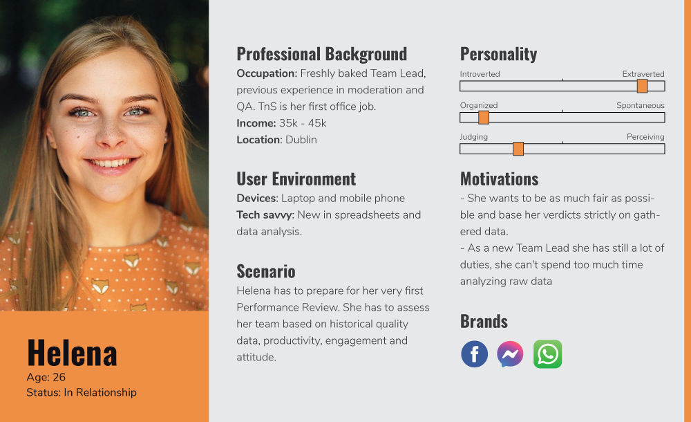
Personas
Define
Work in progress
