Introduction
Challenge
Our client is a start-up airline called Fly UX. They’re looking to create an online experience that is fast, easy, and intuitive: one that’s base on a deep understanding of their target users.
Business Goal
Design a new mobile app for Fly UX. Focusing specifically on the flight booking process: how users search for, find and select flights online.
The end goal is to design and build a clickable prototype that can be tested with users, along with a detailed set of wireframes.
Research
Competitive Benchmarking
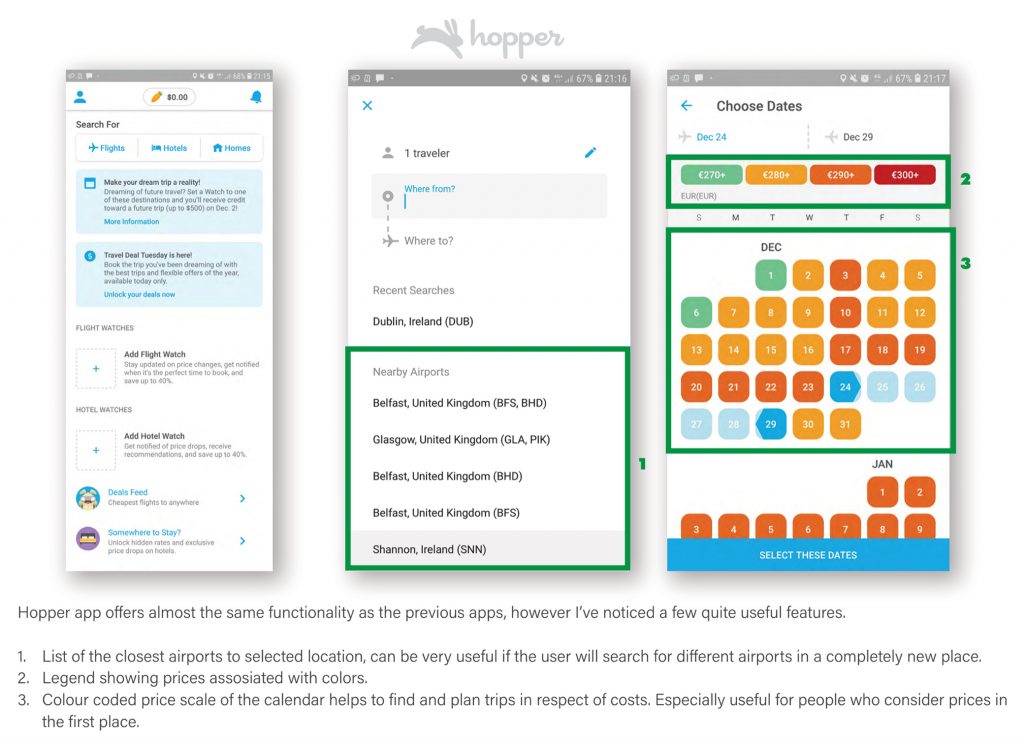
I have selected three apps for flight companies to compare in this exercise. World award 2020 winning for the best airline, Singapore Airline. As a second, Qatar Airline from the Middle East and as a third one, very popular in Europe budget-friendly Ryanair. I want to cross-check layouts and features between those 3 apps. Placing screenshots along each other helped me better spot good and bad design solutions. Perfect for outlining good practices and the latest trends. Additionally, I have analyzed another mobile app. Hopper is a kind of travel aggregator app.
In this exercise, I’m using color-coding to highlight important areas.

Conclusions
By placing different apps side by side it’s easier to spot bad or good design. It can help to distinguish which features and methods are worth to be used and which one is better to avoid in our product.
- It is very important to give a well-balanced amount of information on the first page. Wisely use area with a banner.
- Group the most important features and show only the most relevant.
- Proper greeting messages can help to build a good relationship between the user and the product.
- Multi-city search options and reversing airports are very useful features, it would be worth including them.
- Vouchers/promo codes can attract users and encourage them to proceed with booking in our service.
- The calendar should contain a clear date picker, highlighting selected ranges. Optionally departure and return airport. Also, it would handy to include something that will indicate prices per day.
- For many people traveling conditions are very important it would be good to include a clear way to compare
and select the right fare type.
Online survey
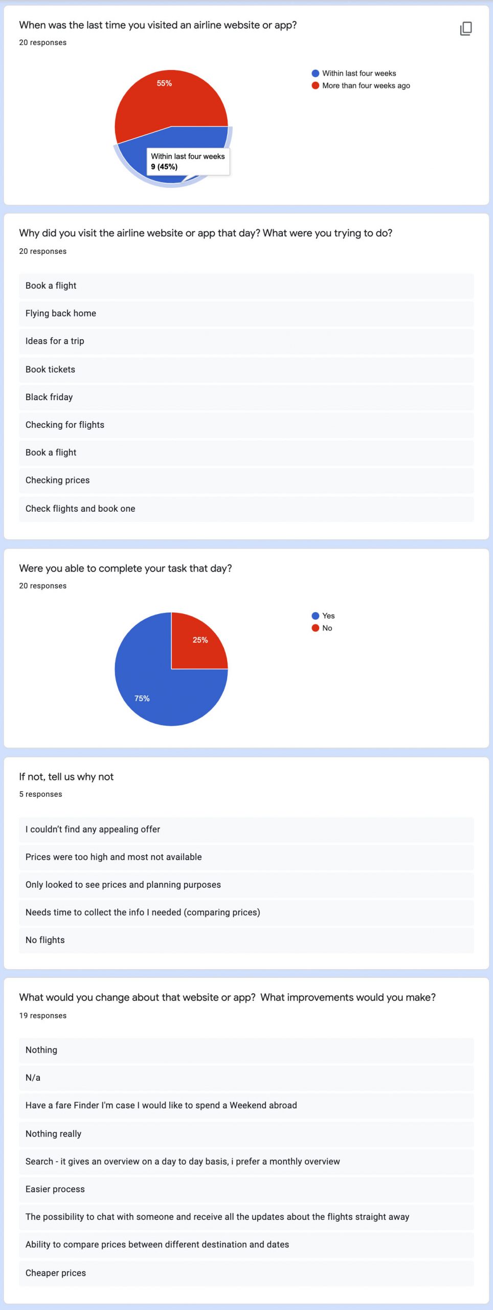
Online forms are perfect for collecting qualitative and quantitative data. Learning more about the goals of people that use airline websites and apps. What they are trying to do. Whether anything is preventing them from doing it, and what other features they would like to see in the product. Online forms can reach a wider audience, can be conducted without our attention, and collect structured information. For this research, I have chosen Google Forms.

Google form allows you to live to preview the basic results. Answers can be extracted to do Google Spreadsheets for deeper analysis. This is perfect for sorting and grouping qualitative data.
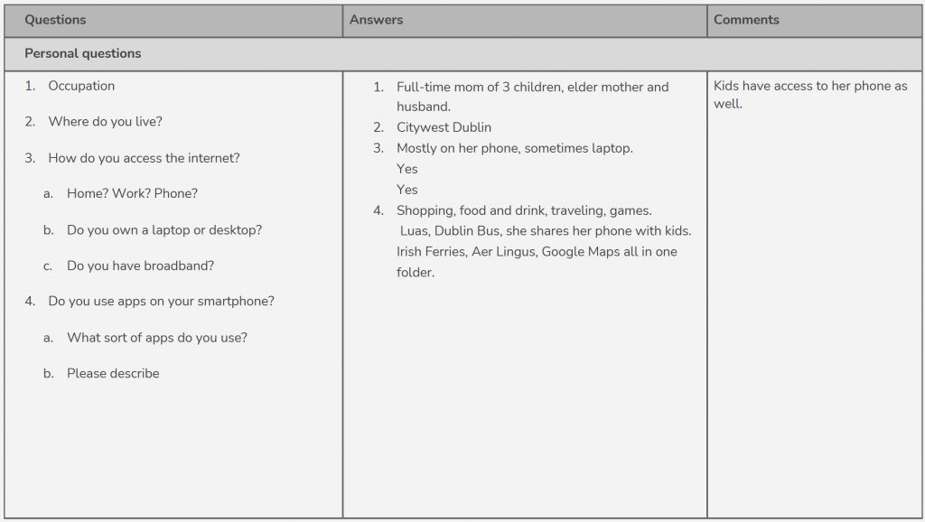
Usability test / Note-taking
As a next step, I was taking notes from the previously recorded usability tests. Based on the observations I was able to collect a lot of useful information, not only based on verbal feedback from the user. But also I reflected body language and the user’s actions visible on the screen.

I have divided my notes into 3 columns:
- The first one contains all questions and tasks.
- The second one contains direct answers from the user
- The third one is for additional comments. Reactions or highlights for future reference.
Questions were selected to better understand what kind of person is taking the test. I wanted to examine the background of the user and experience in using that kind of apps. In the last part, we had some tasks to do complete in two previously selected apps. Thank to this exercise I could collect a lot of useful qualitative information.
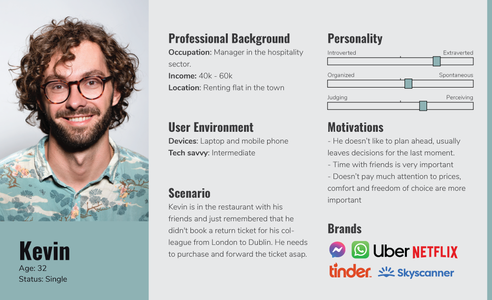
Personas
I have created these personas based on usability test interviews. Also, I took results from the online survey to create the most common scenarios.

Define
Affinity Diagram
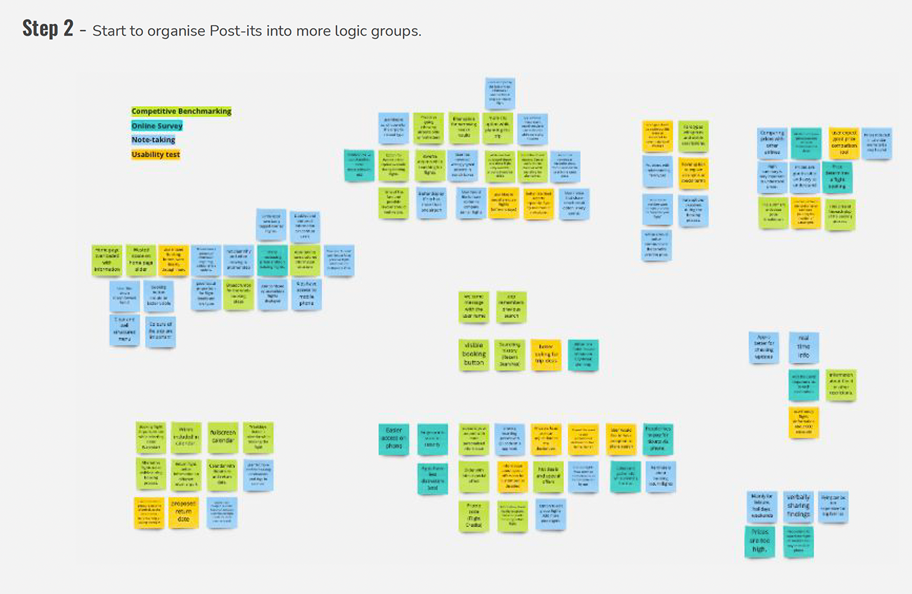
For this task, I was using Miro. I have shared my research data from previous exercises with another person. We conducted remote session using online visual collaboration software Miro. We have revied the research data and made notes on virtual Post-its. The whole analysis took no more than 15 min. Then we stuck the Post-its to the whiteboard and started to organize them into more logical groups. After that, I have drawn a border around each group and gave them meaningful names.


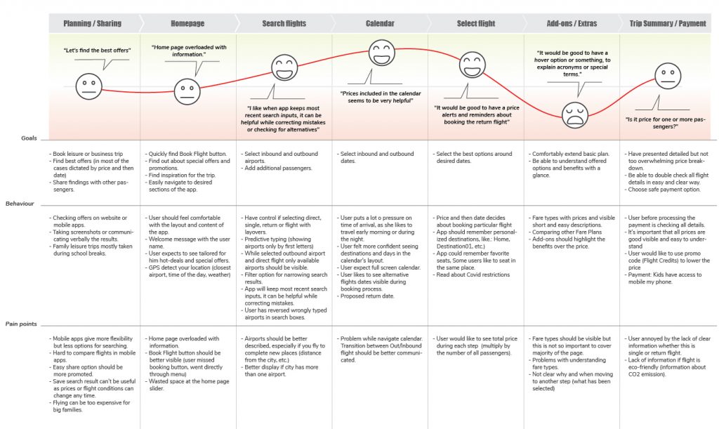
Customer Journey Map
I have prepared a Customer Journey Map to define the high-level steps in the journey. These steps are corresponding to the groups from Affinity Diagram. Listed steps are supported with user goals, behaviors and pain points. This is a very valuable exercise allowing me to better visualize each move of the customer.
Design
Flow Diagram
This is the very first step in the design process. The overall objective is to fix the issues I’ve uncovered during research, which are highlighted on the customer journey map. I have defined a high-level flow for the mobile app. Focused on one specific scenario which is booking the flight.

Interaction Design
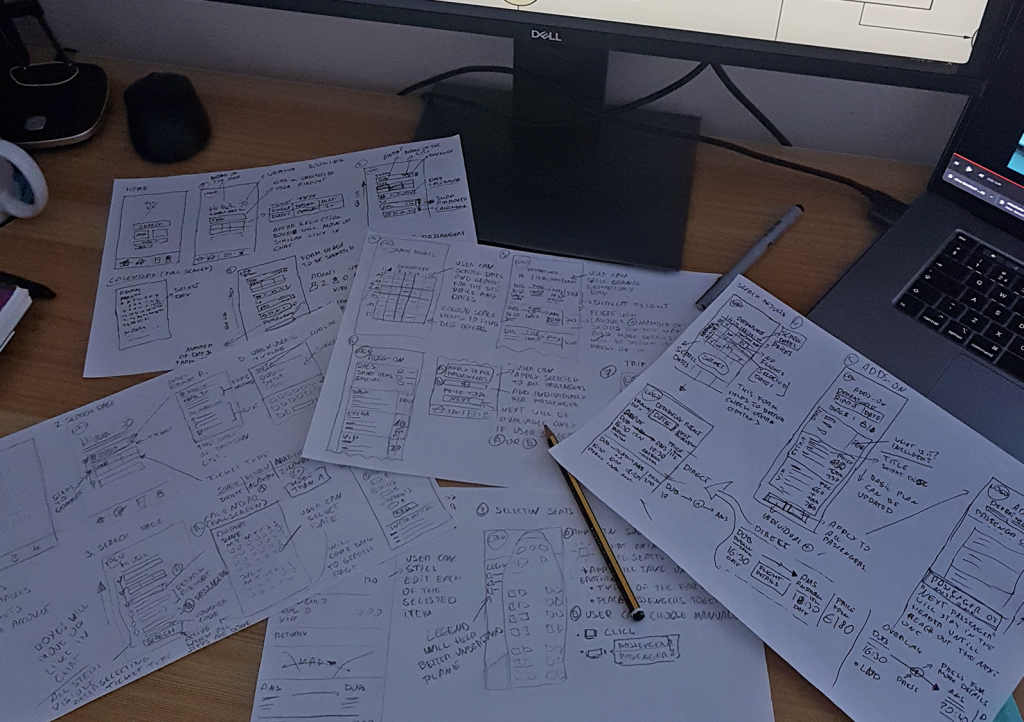
In this step, I was continuing the design process and sketched the screens for the mobile app. Hand drawings can be quicker edited and helped me to better visualize my ideas. I used screens from Flow diagram.
Prototype
In this step I have created a medium fidelity prototype for the Fly UX mobile application using Figma. I’ve already defined much of the solution with flow diagrams and sketches. With Figma I was adding more details in the form of interactivity.
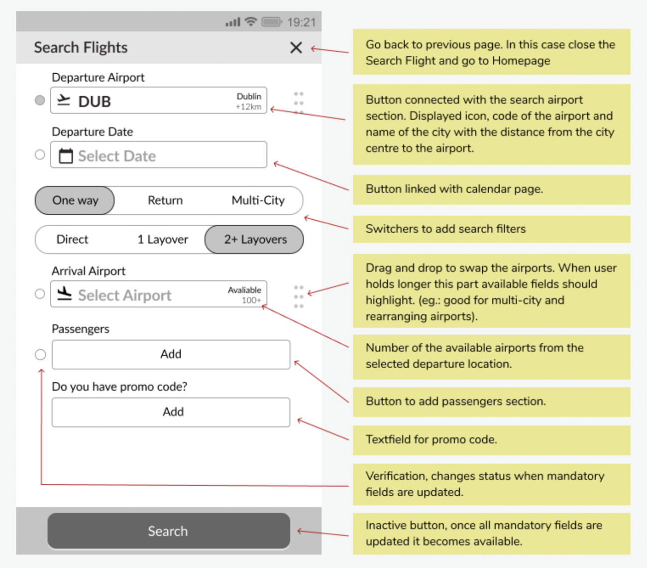
Wireframes
Once the prototype is tested and approved it’s time to pass work to developers and UI designers. In this step I have defined the extra details that developers need to build the product accurately.
It is very important to make sure the wireframes contain all the necessary detail developers would need to build the application accurately